Unlocking Insights with an HR Dashboard
At its core, an HR dashboard is a visual command centre, pulling together your most critical workforce data into one accessible place. Think of it like the instrument panel in a cockpit—it gives leaders a real-time read on all the vital metrics, allowing them to shift from reactive fire-fighting to proactive, data-driven strategy.
What Is an HR Dashboard and Why Does It Matter?

Trying to manage a workforce without an HR dashboard is like navigating a complex city with a torn, outdated paper map. You have bits of information, sure, but they’re scattered across endless spreadsheets, static reports, and siloed HR systems. This fragmented view makes connecting the dots and seeing the bigger picture almost impossible.
An HR dashboard cuts through that chaos. It pulls data from all those different sources and presents it through intuitive charts, graphs, and tables. Suddenly, raw numbers are transformed into a clear, compelling story about your organisation’s health.
Moving from Reporting to Strategizing
The real magic of an HR dashboard is how it elevates the human resources function from a purely administrative role to a strategic one. Instead of just reporting on what happened last quarter, a dashboard helps you understand the why behind the numbers.
For example, you can visually link high turnover rates in one department with their low employee engagement scores or a pattern of below-average manager ratings. This kind of insight allows you to tackle the root cause before the problem spirals. A well-designed dashboard empowers HR leaders to:
- Spot Trends Early: Identify emerging patterns in hiring, performance, and retention as they happen, not months later.
- Improve Decision-Making: Back up your recommendations to the C-suite with hard data, replacing guesswork with confidence.
- Enhance Communication: Give managers and executives clear, easy-to-digest insights into their own teams’ performance.
An HR dashboard isn’t just another reporting tool. It’s a strategic asset that turns workforce data into a genuine competitive advantage, enabling smarter and faster people-decisions.
This shift towards data-driven HR is reflected in major market trends. The Indian HR technology market, valued at roughly USD 1,120 million in 2024, is set for significant growth, largely fuelled by the rising adoption of workforce analytics and dashboards. This underscores how vital data has become in managing modern workforces effectively. You can read more about the Indian HR technology market growth.
What Key Metrics Should Every HR Dashboard Have?
A dashboard is only as good as the numbers it shows. Think of it this way: a pilot relies on specific instruments to know their speed, altitude, and direction. In the same way, an HR leader needs the right metrics to navigate the complex world of workforce management. These key performance indicators (KPIs) are what turn raw data into a clear story about your organisation’s health, culture, and efficiency.
Picking the right metrics is everything. Sure, headcount is a fundamental number, but a truly effective HR dashboard goes much deeper. It needs to give you a balanced view of what’s already happened (lagging indicators) and what’s likely to happen next (leading indicators). This is how you build a proactive talent strategy instead of just reacting to past events.
The infographic below puts a spotlight on some of the most critical metrics that should be the foundation of any strategic HR dashboard.
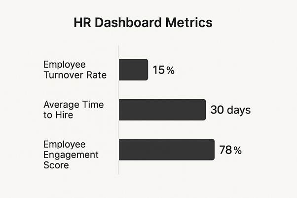
This snapshot, for example, shows a moderate turnover rate, a competitive time-to-hire, and a strong engagement score. It paints a picture of a relatively healthy workforce, but with clear areas for improvement.
Core Recruitment and Retention Metrics
These are the numbers that track the flow of talent into and out of your organisation. They’re the bedrock of workforce planning and tell you a lot about how attractive your company is as a place to work.
- Employee Turnover Rate: This is simply the percentage of employees who leave the company over a specific period. A high rate can be a red flag for issues with company culture, management styles, or compensation. Understanding this is the first step toward stability.
- Time to Hire: This tracks the number of days between posting a job and a candidate accepting the offer. If this number is too high, it can mean lost productivity and point to bottlenecks in your recruitment process.
- Cost per Hire: This calculates your total investment to get a new employee on board, covering everything from advertising and recruiter fees to interview time. Keeping an eye on this helps you optimise your recruitment spend and show the real financial impact of HR.
Employee Engagement and Performance Metrics
Once you’ve brought great talent in the door, you need to measure how engaged, satisfied, and productive they are. These metrics give you a window into the day-to-day employee experience.
An engaged employee isn’t just happier; they are more productive, more innovative, and far more likely to stay. Engagement metrics are powerful leading indicators that can help predict future retention rates and business performance.
Key metrics to keep on your radar include:
- Employee Engagement Score: Usually gathered from pulse surveys or annual reviews, this score puts a number on employee satisfaction, motivation, and their connection to the company’s mission.
- Absenteeism Rate: Tracking unscheduled absences can shine a light on potential problems with employee well-being, burnout, or disengagement within certain teams.
- Performance and Potential: Often shown in a 9-box grid, this metric is fantastic for identifying high-performers for succession planning and pinpointing individuals who might need extra support or development.
To illustrate how these metrics play out, let’s compare some of the most essential ones side-by-side.
Key HR Dashboard Metrics Comparison
The following table breaks down a few essential HR metrics, explaining what they measure and, more importantly, how they impact strategic decision-making.
| Metric | Definition | Business Impact |
| Turnover Rate | The percentage of employees who leave the organisation over a set period. | High turnover can indicate poor culture or management, leading to increased recruitment costs and lost knowledge. |
| Time to Hire | The number of days from a job posting going live to a candidate accepting the offer. | A long time-to-hire can result in lost productivity and may signal inefficiencies in the recruitment process. |
| Employee Engagement | A score, usually from surveys, measuring employee satisfaction, motivation, and connection to the company. | High engagement is directly linked to higher productivity, innovation, and better employee retention. |
| Cost per Hire | The total cost of hiring a new employee, including advertising, recruiter fees, and interview time. | Tracking this helps in optimising recruitment budgets and demonstrating the financial value of HR activities. |
| Absenteeism Rate | The rate of unscheduled employee absences due to sickness or other causes. | A rising rate can be an early warning sign of employee burnout, low morale, or workplace stress. |
This comparison shows that each metric tells a unique part of the story. A good dashboard brings them all together to provide a complete picture of your workforce’s health.
The growing focus on this kind of data is unmistakable. India’s HR analytics market is projected to hit around USD 379.6 million by 2030, all driven by the need for tools that can track talent, engagement, and retention. This rapid growth signals a clear shift toward using comprehensive HR dashboards to make smarter decisions about human capital. You can discover more insights about India’s HR analytics market.
The Strategic Benefits of Using an HR Dashboard

Moving beyond just collecting data, an HR dashboard is where your metrics start making a real business impact. This isn’t about making pretty charts; it’s about drawing a straight line from your people-data to the company’s performance, profitability, and long-term goals. It’s what transforms HR from a support function into a vital partner in the C-suite.
Think about a company wrestling with high employee turnover. Without a dashboard, this problem is just a frustrating number. But with a dashboard, leaders can see the story unfold. They can visually connect an attrition spike in a specific department with other data points, like dipping engagement scores, a rise in absenteeism, or below-market pay for that team.
This kind of clarity allows for surgical interventions, not expensive guesswork. Pinpointing the real reason people are leaving means the company can deploy targeted fixes, potentially saving millions in replacement and training costs. This is the true power of a strategic HR dashboard.
Driving Proactive Talent Management
One of the biggest wins is the shift from reactive problem-solving to proactive talent strategy. By visualising hiring data in real-time, a recruitment team can spot bottlenecks in their process instantly. For example, if the ‘time-to-fill’ for a critical role suddenly jumps, the dashboard can help diagnose the cause. Is it a lack of qualified candidates, slow manager feedback, or offers that aren’t competitive enough?
One organisation found their average time-to-fill for tech roles was nearly double the industry benchmark. A quick look at their dashboard revealed the delay was happening at the technical interview stage. By reallocating resources and streamlining that specific step, they slashed their overall time-to-fill by 40%, helping them secure top talent before competitors even had a chance.
This proactive mindset applies to almost every part of HR:
- Compensation Optimisation: Dashboards help you ensure pay scales are fair and competitive across the board, flagging any discrepancies that could lead to dissatisfaction or legal trouble.
- Succession Planning: By mapping performance data against career goals, HR can spot and groom future leaders, ensuring the business is always prepared for what’s next.
- Diversity and Inclusion Goals: Real-time metrics let you track progress towards your D&I targets, making these goals transparent and keeping everyone accountable.
A well-designed HR dashboard does more than just present information. It tells a story about your workforce, revealing opportunities and risks that would otherwise remain hidden within spreadsheets. It becomes the evidence-based foundation for every major people decision.
Enhancing Employee Engagement and Retention
Hanging on to good employees is one of the biggest challenges facing businesses today. A dashboard gives you the tools to not just measure retention but to actively improve it. By tracking metrics like engagement scores, promotion rates, and training participation, HR can spot the early indicators of employee satisfaction.
For instance, a dip in engagement survey scores within a particular team could be an early warning that turnover is on the horizon. This gives managers a chance to step in, gather feedback, and fix problems before valued team members start updating their Curriculum Vitae.
Using this data to improve the work environment is a direct path to better morale and loyalty. Once you identify the core issues, there are many simple and effective ways to improve employee engagement.
Ultimately, the strategic benefits are crystal clear. An HR dashboard provides data-driven clarity, encourages proactive decisions, and directly connects HR activities to the company’s bottom line.
It empowers leaders to not just manage their people, but to build a more resilient, engaged, and high-performing organisation. It becomes the cornerstone of strategic HRM, giving you the insights to navigate challenges and seize opportunities with confidence.
How to Successfully Implement Your HR Dashboard
Launching a new HR dashboard is a big deal. It’s far more than just buying a piece of software; it’s a strategic move that needs a careful and considered rollout. Great technology alone won’t guarantee success. The real magic lies in a solid plan that accounts for your data, your people, and your business goals right from the start.
Interestingly, the journey doesn’t begin with flashy software demos. It starts with an honest look at your current data. An HR dashboard is only as useful as the information it displays, making data quality the absolute first hurdle. You have to dodge the classic ‘garbage in, garbage out’ trap by cleaning up and standardising your data sources before you do anything else.
Laying the Groundwork for Success
Before you even think about talking to vendors, you need to get your leadership team on board. You have to frame the investment in terms they care about: return on investment (ROI), lower turnover costs, and better overall efficiency. Show them how the dashboard will answer critical business questions, not just tick HR boxes.
Once you have their backing, here are your next steps:
- Define Clear Objectives: What specific problems are you trying to fix? Is it about cutting down your time-to-hire? Pinpointing why people are leaving? Or keeping a finger on the pulse of employee engagement? Set measurable goals from the outset.
- Assemble a Cross-Functional Team: This isn’t just an HR project. You’ll need IT to handle the technical side, finance to track cost-related metrics, and department heads to make sure the dashboard gives them the insights they actually need.
- Audit Your Data Integrity: It’s time to get your hands dirty. Go through the data in your HRIS, payroll, and recruitment systems with a fine-tooth comb. Look for inconsistencies, missing details, and old, outdated records. This cleanup phase is non-negotiable if you want to build a dashboard that leaders can truly trust.
Choosing and Rolling Out the Right Technology
With a solid foundation in place, now you can start looking at the tech. The right HR dashboard solution should plug into your existing systems—like your HRIS and payroll software—without a fuss. You’re looking for a tool that’s simple enough for a non-tech person to use but powerful enough to offer deep, meaningful insights.
The goal is to choose a tool that empowers your team, not overwhelms them. A dashboard that is difficult to navigate will quickly be abandoned, no matter how powerful its features are.
When it’s time to go live, how you manage the change is everything. Just giving managers a login and hoping for the best is a surefire way to fail. Instead, you need to provide hands-on training that speaks directly to their daily challenges.
Show a sales manager how to track their team’s performance or a department head how to spot their attrition risk. When they see how the tool solves their problems, they’ll actually use it. This kind of strategic thinking is also vital if you’re considering data-driven high-impact hiring with RPO.
This shift towards data-driven HR is becoming the norm across India. A recent report pointed out that 69% of Indian organisations are now automating their HR operations, with dashboards playing a huge part.
This embrace of analytics and AI-powered tools is paving the way for faster, smarter decisions in talent management. By following a structured plan, you can make sure your new dashboard becomes a go-to resource, not just another piece of forgotten software.
Best Practices for HR Dashboard Design and Management
A great HR dashboard is a thing of beauty—intuitive, insightful, and so easy to use it quickly becomes indispensable for decision-makers. A poorly designed one? It’s a cluttered mess of charts and numbers that gets ignored, completely wasting the potential of your valuable people data.
To make sure your dashboard delivers real value, you need to focus on both thoughtful design and disciplined management. The whole point of a dashboard is to tell a clear and immediate story. It should provide answers at a glance, not create more questions. That requires a deliberate approach to presenting information, tailored specifically to the people using it day in and day out.
Prioritise a User-Centric Design
Before you even think about picking a chart or graph, ask yourself one crucial question: who is this for? The answer changes everything. A dashboard built for the C-suite will look worlds apart from one designed for a recruitment manager or a department head.
- For Executives: They need the 30,000-foot view. Focus on high-level, strategic metrics like overall headcount, total labour costs, and company-wide turnover rates. They need a quick pulse-check on organisational health.
- For HR Managers: This is where you get more granular. They’ll want operational metrics like time-to-hire, cost-per-hire, and employee engagement scores broken down by department.
- For Line Managers: Bring it right down to the team level. They need immediate insights into their own team’s performance, absenteeism rates, and training completion status to manage their people effectively.
By customising the view for each audience, you ensure the information isn’t just available—it’s relevant and actionable. That’s the secret to getting people to actually use it.
Master the Art of Data Visualisation
Just throwing numbers on a screen isn’t going to cut it. The way you visualise data determines how quickly and easily it can be understood. Choosing the right chart type is essential for telling a compelling story with your metrics.
Think of each chart as a sentence in that story. A line chart is perfect for showing a trend, like tracking your turnover rate over the last 12 months. A bar chart, on the other hand, is ideal for comparing categories, like headcount across different departments.
The most effective dashboards use a variety of visualisations strategically. The goal isn’t just to display data, but to guide the user’s eye to the most important insights, making complex information digestible in seconds.
Keep your visuals clean and simple. Ditch the clutter—unnecessary labels, 3D effects, and distracting colours have no place here. Every single element on the screen should serve a clear purpose, contributing to the overall narrative of your workforce.
Ensure Strong Governance and Maintenance
An HR dashboard isn’t a “set it and forget it” project. It’s a living tool that needs ongoing care to remain a trusted source of truth. Without proper governance, even the most beautiful dashboard can quickly become unreliable due to data errors or outdated information.
Establishing clear governance from the get-go is non-negotiable. This means defining who is responsible for data accuracy and who has the authority to change the dashboard. Regular data audits are critical to catch and fix inconsistencies before they start eroding trust in the system.
Here are a few key practices to put in place:
- Define Data Ownership: Assign clear owners for each metric. The recruitment team owns ‘time-to-hire’, while the compensation team owns salary data. Simple.
- Establish Data Standards: Create crystal-clear definitions for all your metrics so everyone is speaking the same language. What exactly is included in your ‘turnover rate’ calculation?
- Schedule Regular Audits: Set a recurring schedule to check for data inaccuracies, fix errors at their source, and make sure all integrations are running smoothly.
- Control Access Securely: Use role-based permissions to control who sees what. This protects sensitive employee information and ensures managers only see data relevant to their teams.
By blending user-centric design with disciplined data management, your HR dashboard will transform from a simple reporting tool into a strategic asset that guides better, faster people-decisions across the entire organisation.
FAQs on HR Dashboards
As more and more organisations lean on data to make smarter decisions, the HR dashboard is quickly becoming mission control for people strategy. But like any powerful tool, its arrival often sparks a flurry of questions. What exactly is it? How is it different from the reports we already have? How do we pick the right one?
Getting straight answers to these common questions is the first step. It’s the key to moving beyond just having the tech and actually using it to make a real impact on the business.
What’s the difference between HR Dashboard and HR Report?
This is probably the most common point of confusion, but the distinction is pretty simple. Think of it like this: your car’s dashboard versus its annual service record. One gives you real-time data to navigate the road ahead (speed, fuel, engine warnings), while the other is a detailed history of what’s already happened.
The core difference is that an HR dashboard is a living, breathing tool. It’s visual, interactive, and built to give you a live, at-a-glance view of your workforce right now. You can click, filter, and dig deeper into the data to spot trends as they emerge.
An HR report, on the other hand, is a static snapshot. It’s usually a text-heavy document you get once a month or quarter for historical analysis or compliance. A report will tell you what last quarter’s turnover rate was. A dashboard will show you who is at risk of leaving today, giving you a chance to step in.
A dashboard is for monitoring and making quick, in-the-moment decisions. A report is for deep-dive reviews and record-keeping. You need both, but you can’t substitute one for the other.
How to Choose the Right HR Dashboard Tool
Picking the right software is a big deal. The choice you make today will shape how your organisation uses people data for years. The market is crowded with options, from standalone analytics platforms to modules tucked inside larger HR systems. The “best” tool isn’t a one-size-fits-all answer; it’s the one that fits your company’s reality.
To narrow down the options, here are the core things to look at:
– Company Size and Scalability: A 50-person startup has very different needs than a 5,000-person global enterprise. Find a solution that works for you today but also has the legs to grow with you tomorrow.
– Integration Capabilities: This is non-negotiable. Your dashboard has to talk to your other systems—HRIS, payroll, applicant tracking—without a fuss. If it doesn’t, you’re signing up for a world of manual data entry and insights you can’t trust.
– Ease of Use: If your managers need a PhD in data science to use it, they won’t. Look for a clean, intuitive interface. The goal is to make data accessible to everyone, not just the analytics team.
– Budget and Total Cost of Ownership: Don’t just look at the price tag. Factor in the cost of implementation, training, and any ongoing maintenance fees. Get the full picture of your investment.
How to Get Your Managers to Actually Use the Dashboard
Let’s be honest: even the slickest, most expensive dashboard is just a pretty picture if nobody logs in. Getting managers on board requires more than just an email announcement. It needs a real change management plan.
The secret is to solve their problems. A line manager worried about high turnover on their team doesn’t want a lecture on predictive analytics. They want a tool that flags which team members are flight risks and tells them why.
Here are a few proven ways to drive adoption:
– Provide Role-Specific Training: Ditch the generic, one-size-fits-all training sessions. Show sales managers how to track their team’s performance KPIs. Walk operations managers through monitoring absenteeism trends. Make it immediately relevant to their world.
– Create Customised Views: Don’t make them hunt for the information they need. Set up default dashboards for different roles that put their most critical numbers front and centre.
– Lead by Example: When the leadership team starts referencing dashboard data in their meetings and decisions, it sends a clear signal: “This is how we do things now.”
– Gather Feedback and Iterate: The dashboard shouldn’t be a static tool. Check in with your managers regularly. What’s working? What’s not? What data do they wish they had? Use that feedback to keep making the tool better and more valuable.
At Taggd, we specialise in building data-driven recruitment strategies that deliver measurable results.
Discover how our Recruitment Process Outsourcing services can help you build the high-performing teams your business needs.